From Data to Decisions
A Discipline of Causal Thinking for Business Leaders
Marcelo Katogui
March 02, 2026
Executive Summary
Most companies allocate capital based on correlations. Few ask whether the action caused the outcome. The difference between those two questions is not a statistical refinement — it is the difference between investing in what works and investing in what merely accompanies success.
This essay is for leaders who commission analysis, approve decisions, and are accountable for outcomes. It does not explain how to build causal models. It explains how to demand, evaluate, and act on causal evidence — and how to recognize when an analysis that looks rigorous is answering the wrong question entirely.
Five Questions Every Intervention Must Answer
- What exactly are we trying to change? — Name the outcome, the population, and the time window before any analysis begins.
- What would have happened without us? — Identify the counterfactual. If you cannot state it, the comparison group is not defined.
- What hidden forces drove who received the intervention? — Name the confounders. Unmeasured ones are not missing data problems — they are design problems.
- How much hidden bias would overturn this finding? — Demand a stress test with a named threshold, not a p-value.
- What would change our recommendation? — State the condition that would reverse the decision before committing to it.
Running example. A single case threads through this essay: a SaaS company’s voluntary onboarding program. Enrolled users show 72% ninety-day retention versus 51% for non-enrolled users — a raw gap of 21 percentage points. By §9, that number collapses to 9 points. The distance between 21 and 9 is the cost of skipping the discipline.
1. Why Prediction Is Not Enough
A model that predicts churn with 94% accuracy tells you who is about to leave. It does not tell you whether contacting them will help. These are different questions, and most production systems never notice the difference.
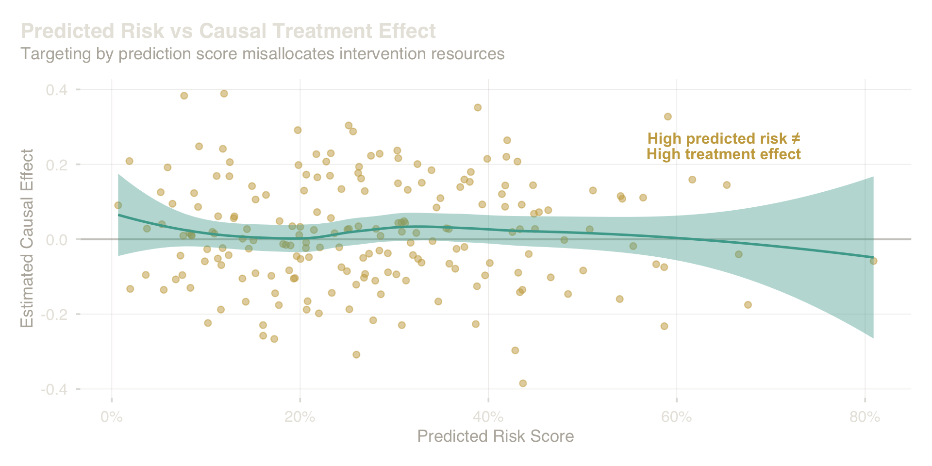
Consider a discount campaign. You train a model on historical data, score every customer by predicted churn probability, and intervene on the top decile. The model is accurate. The targeting is precise. And yet the campaign may produce no incremental retention — because customers sort into three groups that a predictive model cannot distinguish. Some will leave regardless of what you do — the discount lands, they cancel anyway. Some will stay regardless — they are going through a rough patch that resolves on its own. And some are genuinely persuadable — on the fence, and the right offer changes their decision. The predictive model ranks all three groups by their probability of churning. But only the third group responds to intervention. Targeting the top decile by churn score concentrates spend on the first two groups and misses the third entirely. The model confuses who will churn with who can be saved by acting.
Prediction ranks units by expected outcome. Intervention requires the causal effect — a fundamentally different quantity.
The scatter above makes this structural: there is no relationship between how risky someone looks and how much an intervention will help them. Units at the far right of the risk distribution often show near-zero or negative treatment effects. A campaign that allocates resources by predicted score systematically invests in the wrong people.
This is not a model quality problem. A perfect predictive model would make the same mistake — because it answers the wrong question. The question a business decision requires is: what happens to this person if we act versus if we do not? That question is causal, not predictive. Getting the question right is the first act of serious analysis.
2. The Core Idea: Counterfactual Thinking
Every business intervention implicitly asks a question that data cannot answer directly: what would have happened if we had done things differently?
When you ask “did the onboarding program work?”, you are really asking: among the users who went through the program, what would their retention have been if they hadn’t? You observe only one version of events. The counterfactual — what would have happened under the alternative — is never in your data.
This is the fundamental constraint. It is not a limitation of your database or your modeling toolkit. It is a logical impossibility: the same person cannot simultaneously be enrolled and not enrolled, and so we can never directly observe both outcomes for any single individual.
What we can do is construct a credible comparison. Instead of observing one person under both conditions, we find groups of people who are — in all relevant respects — similar enough that the comparison between them approximates the comparison we cannot make directly. The quality of that comparison is everything. When it is credible, we have a causal claim. When it is not, we have a descriptive correlation being called something it is not.
Three versions of this comparison matter in practice:
| What You Want to Know | The Right Question |
|---|---|
| Did the program work across everyone? | What would the average outcome have been with vs. without it, across the full population? |
| Did it work for the people who actually used it? | What would the treated group’s outcome have been if they had not been treated? |
| Should we target a specific segment? | What is the effect within a particular type of user? |
The first is the right question for a universal deployment decision. The second is the right question for evaluating a past program. The third is the right question for targeting. Confusing them — and most organizations do — produces estimates that look precise but answer the wrong question and lead to incorrect decisions.
Back to the onboarding program. The right question here is the second one: for users who enrolled, what would their ninety-day retention have been without the program? The raw 21-point gap does not answer this — it compares enrolled users to non-enrolled users, who were different people with different motivation levels before enrollment was ever offered.
3. Why Observational Data Is Dangerous
The fundamental threat to any comparison built from observational data is this: the groups you are comparing may differ in ways that drive the outcome you are measuring — and those differences have nothing to do with the intervention.
In the onboarding case, motivated users enroll. Motivated users also retain. If you compare enrolled to non-enrolled users, you are not measuring the effect of the program — you are measuring the combined effect of the program and the pre-existing motivation gap. The signal is contaminated before your model runs a single regression.
This is the hidden driver problem. Some force — motivation, intent, product fit, manager quality, economic circumstance — operates in the background, pulling both the treatment and the outcome in the same direction. You cannot see it in your data, and you cannot adjust for what you cannot see. This is not a data quality issue. Richer data helps, but it never resolves the problem completely. The solution is structural: design the comparison so that hidden drivers are less likely to distort it.
Two additional threats compound the problem.
The comparable groups problem. In some datasets, certain types of units were always treated — there is no untreated version of them to compare against. When there are no comparable untreated counterparts for a treated unit, any estimate for that unit is extrapolation dressed up as measurement. The comparison needs to be supported by data, not manufactured by the model.
The spillover problem. Treating one unit often affects others. A new product feature rolled out to one team changes how that team interacts with colleagues on other teams. A discount offered to a market segment reshapes competitive dynamics. When the behavior of treated units leaks into your control group, your control group is no longer a clean baseline. Interventions with network effects, shared environments, or competitive dynamics require designs that account for this contamination.
The core discipline. Before building any model, answer three questions: What forces determine who gets treated? Are those forces also connected to the outcome? And are there untreated units in my data who could have been treated and who resemble those who were? If you cannot answer these with confidence, no model will rescue the analysis.
4. Drawing the System Before Modeling It
The most consequential act in causal analysis is drawing a diagram — before any data is loaded, before any model is specified, before any variable is selected for adjustment.
The diagram is a claim. Every arrow says: this thing directly influences that thing. Every missing arrow says: there is no direct path here. The diagram encodes your theory of the world. If the theory is wrong, the estimates will be wrong — regardless of model sophistication.
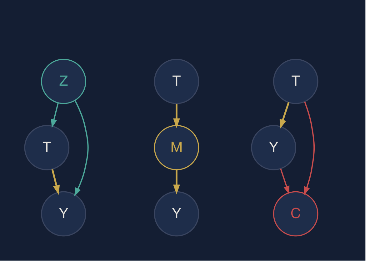
Three canonical structures. Which variables you adjust for — and which you do not — is determined entirely by the system’s structure.
The diagram captures three structures that govern every observational analysis.
The confounder (left) is a variable that causes both the treatment and the outcome. Marketing budget drives both campaign spend and sales. Seniority drives both training participation and performance. You must account for confounders — but you identify them from domain knowledge, not from feature importance scores or p-values.
The mediator (center) is how the treatment works. Onboarding improves product familiarity, which then improves retention. Product familiarity is a mediator. If you adjust for a mediator — include it in your model to “control for it” — you block the very path through which the treatment operates and your estimate shrinks toward zero. This is one of the most common analytical errors in production systems. Analysts add variables because they are available and correlated with the outcome. The diagram tells you which variables you must add and which you must not.
The common effect (right) is a variable caused by both treatment and outcome but with no direct effect on either. Adjusting for a common effect creates a spurious association between treatment and outcome where none exists causally. The most common form: filtering analysis to “active users” — a variable caused by both the product intervention and user satisfaction — makes interventions look effective or ineffective in ways disconnected from their actual impact. Survivorship bias, Berkson’s paradox, and post-hoc segmentation by outcome-adjacent metrics are all instances of this structural error.
The discipline the diagram enforces: every variable you include in an analysis, and every variable you exclude, needs to be justified by the system structure — not by statistical significance, data availability, or model performance.
5. Practical Ways Companies Approximate Causality
Randomized experiments are the cleanest solution — they neutralize hidden drivers by design. But most business questions cannot be answered with experiments: it is too slow, too expensive, or ethically complicated to randomize. The alternative is to engineer a credible comparison from existing data.
Matching is the most direct approach. For each user who received the intervention, you find one or more users who did not but who look as similar as possible on every observable dimension — plan type, company size, activity level, account age. You then compare outcomes within matched pairs. The logic is intuitive: if two users were indistinguishable in every measured way before the intervention, any difference in their subsequent outcomes can be attributed — with appropriate caveats — to the intervention itself.
The quality of matching depends entirely on what you can measure. If the variables that actually drive selection into the treatment are in your dataset, matching can approximate an experiment. If the most important driver is unmeasured — like motivation — matching reduces bias but cannot eliminate it. This is why drawing the system first matters: the diagram tells you what you need to measure before you design the study, not after.
Difference-in-differences (DiD) exploits the fact that some interventions roll out at a point in time to some units but not others. You compare how the treated group changed relative to how the untreated group changed over the same period. The treatment effect is the extra movement in the treated group beyond what the comparison group showed — the difference of the two differences.
The intuition becomes clearer when drawn. Before the intervention, both groups follow similar trends. After the intervention, the treated group diverges while the comparison group continues its prior path. The treatment effect is not the post-period gap alone — it is the change in the gap relative to how the two groups were already moving. If the trends were already diverging before the intervention, the estimate is compromised.
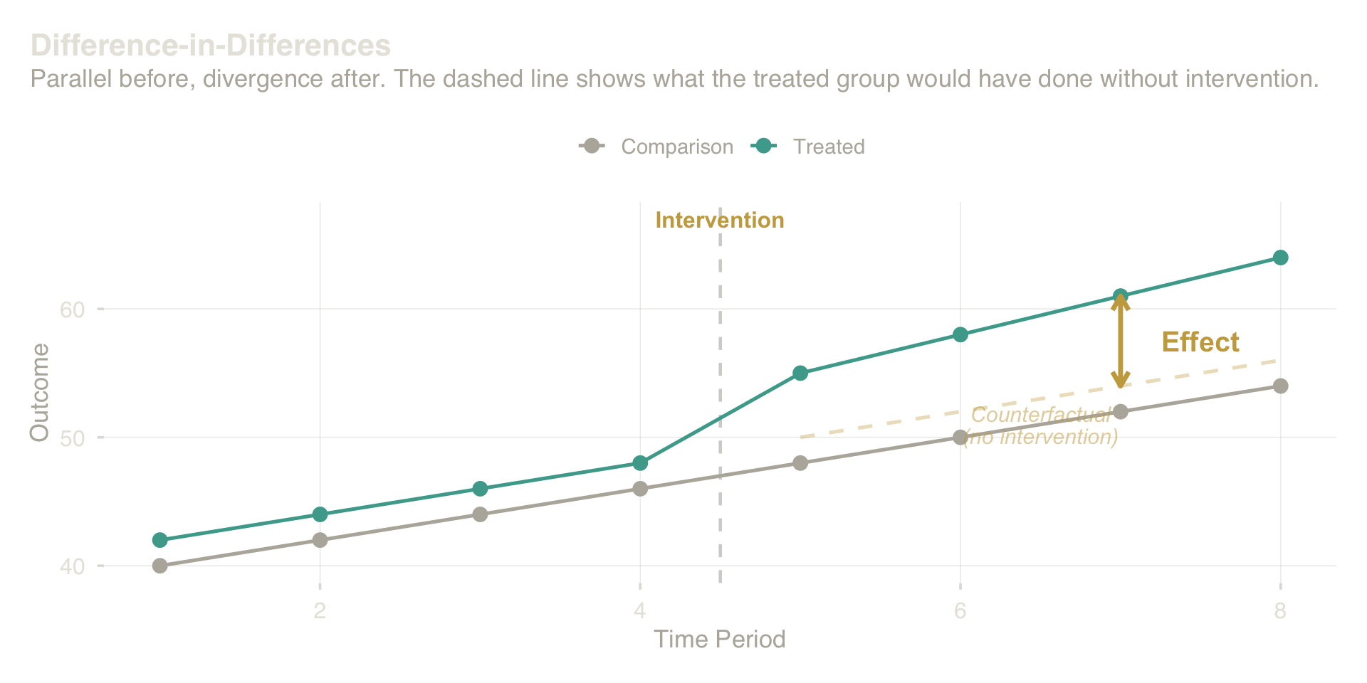
Difference-in-Differences: parallel before, divergence after. The treatment effect is the extra movement in the treated group beyond the comparison group’s trend.
The critical requirement is that pre-intervention trends were parallel — which you can check from historical data, but can never fully prove. When the lines were already diverging before the intervention, the post-treatment gap is not cleanly attributable to the treatment.
Natural experiments arise when who gets treated was determined by something effectively arbitrary — a policy threshold, a geographic boundary, an administrative lottery. A price increase that applied only to accounts created before a specific cutoff date, for example, creates a credible comparison: accounts on either side of that boundary are unlikely to differ in ways that affect retention, except for the price itself. The cutoff is arbitrary from any individual account’s perspective. These situations are rare and must be identified creatively, but when they exist they provide causal evidence as strong as a designed experiment. The key requirement is that the assignment mechanism is unrelated to the outcome except through the treatment itself.
None of these approaches is a black box that produces causal estimates automatically. Each rests on assumptions about the world that must be stated, defended with domain knowledge, and stress-tested. The choice of approach is determined by the structure of the data-generating process — which is the diagram.
6. How Confident Should You Be?
No matter how careful the design, no observational study fully eliminates the possibility that a hidden driver explains the result. Honesty requires quantifying how seriously this possibility should be taken.
The right question is not “could confounding explain this result?” — the answer is always yes. The right question is “how strong would a hidden driver need to be to fully explain away the result?”
If your estimate survives even a moderately powerful hidden driver — one comparable in strength to the measured factors you already account for — the finding is robust. If a trivially small confound would overturn it, the finding is fragile. Stating this threshold is not a disclaimer; it is the evidence. It tells a decision-maker how much weight to put on the estimate.
The same logic applies to the estimate itself. A point estimate — “the program increased retention by 9 percentage points” — conveys false precision. The evidence supports a range, and that range should be widened by uncertainty about unmeasured confounding, not just sampling noise. A decision made on a range of plausible values is qualitatively different from a decision made on a single number. The range makes the risk explicit and legible.
Scenario testing makes sensitivity concrete. Rather than asking about abstract confounders, you identify the two or three specific hidden drivers most plausible in your domain — manager quality, prior product experience, regional economics — and ask: if this factor were operating at realistic strength, what would the estimate become? If the estimate remains commercially meaningful under all plausible scenarios, the conclusion is defensible. If one named scenario collapses it, that scenario needs to be addressed, not buried.
A more precise version of this question is called the E-value: the minimum strength an unmeasured factor would need — in its association with both the treatment and the outcome simultaneously — to fully explain away the result. An E-value of 2.0 means the hidden driver would need to at least double the odds of treatment assignment and double the odds of the outcome to make the finding disappear. An E-value of 1.3 means a weak confounder suffices — the result is fragile. The onboarding case produces an E-value of 1.95, which is assessed in §9.
7. From Insight to Decision
A causal estimate is not a decision. It becomes one when it is translated into the currency of the decision-maker: expected value, probability of a positive return, and the specific conditions under which the recommendation changes.
Consider the onboarding program. The matched causal estimate is 9 percentage points of additional ninety-day retention. At the program’s cost structure and scale, that translates to an expected return on investment of roughly 220%. But that expected value is a distribution, not a number. The lower tail of plausible effects — accounting for unmeasured confounding and estimation uncertainty — implies a small but nonzero probability of negative return.
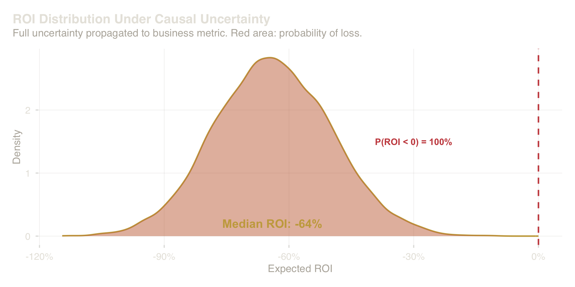
ROI distribution under full uncertainty about the causal effect. The red region shows the probability of a negative return.
This distribution — not the median, the entire distribution — is the object that should reach the executive table. It supports three questions that genuinely govern the decision:
- What is the expected outcome? The center of the distribution.
- What is the downside risk? The probability that the return is negative, or below the business’s cost threshold.
- What changes the recommendation? The parameter sensitivity — which inputs, if revised, would shift the distribution enough to reverse the conclusion?
The business’s threshold matters here. If the program only makes sense at a minimum uplift of 4 percentage points, the question is not “did it work?” but “how confident are we that the effect exceeds 4 points?” That confidence — derived from the full distribution of plausible effects — is the decision-relevant number.
This framing makes the assumptions legible. When an executive sees that the recommendation changes if retention uplift falls below 4 points, they can interrogate the estimate. They can ask whether the comparison was fair. They can request the named scenarios under which the effect might be smaller. The decision becomes a conversation rather than a verdict.
8. Common Executive Mistakes
Targeting by predicted risk, not by expected response. A retention campaign sends discounts to the top-decile churners. But the top-decile churners are exactly the customers who have already decided to leave — the discount arrives after the decision. The persuadable customers are the middle of the distribution. Fix: commission uplift modeling, not churn modeling. The question is who will respond, not who will churn.
Controlling for variables that carry the treatment’s signal. An analyst adds “feature adoption” as a control variable to measure the effect of an onboarding program — unaware that feature adoption is how the onboarding works. The model absorbs the effect into the control and reports a finding close to zero. The program appears inert. Fix: draw the system before specifying the model. Variables the treatment causes must not be adjusted for.
Approving scale-up on a positive average. A wellness benefit shows a positive average effect across the company, so it is expanded globally. In three regions it has a strong positive effect. In two it has a negative effect — employees in those offices already had superior benefits and the program created friction. The rollout harms a third of the workforce. Fix: demand the effect by subgroup before any scale decision, not as an appendix.
Requesting a verdict when the evidence supports only a range. An analyst presents “the program increased retention by 9 percentage points.” A single number requires a single decision: yes or no. But the honest answer is a range — 3.5 to 14.5 points — and the decision is different at the low end than at the high end. Collapsing the range into a point estimate hides the risk of being wrong in the direction that matters most. Fix: ask for the distribution, the probability of loss, and the named condition that would reverse the recommendation.
9. The Onboarding Program: A Worked Example
The SaaS company’s onboarding program is voluntary. Users who enroll show 72% ninety-day retention; users who do not enroll show 51%. Management wants to know: did the program cause this difference?
The naive answer is yes, by 21 percentage points. The naive answer is wrong.
Why motivation distorts the comparison. Motivated users enroll in voluntary programs. Motivated users also retain at higher rates — regardless of onboarding. The raw gap conflates two things: the genuine effect of the program and the pre-existing motivation advantage of the people who chose to use it. Before any analysis, this should be drawn explicitly as a causal diagram:
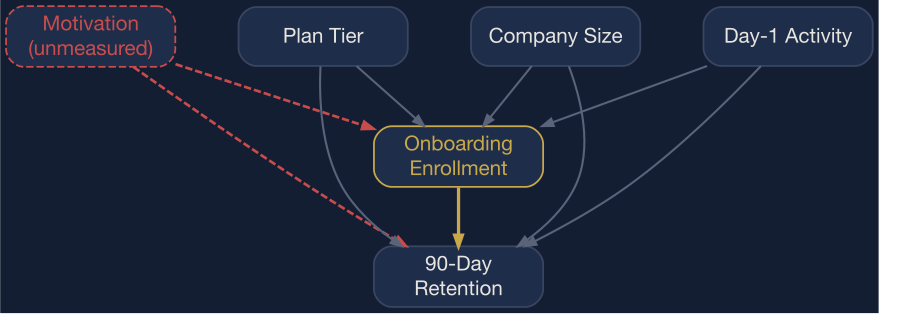
The onboarding program’s causal system. Motivation (dashed) is unmeasured — it causes both enrollment and retention, creating confounding that no regression adjustment can fully resolve.
Every arrow is a claim. The dashed red arrows from Motivation to both Enrollment and Retention are the identification problem: motivation is unmeasured, so no statistical adjustment can fully close that path. Plan Tier, Company Size, and Day-1 Activity are the measured proxies that matching will adjust for.
Building a credible comparison. The analysis matches each enrolled user to a non-enrolled user with a similar plan tier, company size, and day-one activity level. These variables are proxies for motivation and intent — not perfect ones, but the best available. After matching, the two groups look similar on every measured dimension. The comparison within matched pairs now isolates, as cleanly as the data allows, the effect of the program itself.
What the matched estimate says. After matching, the retention gap narrows from 21 to approximately 9 percentage points. The 12-point reduction is the portion of the original gap explained by self-selection. The 9 points that remain are the estimated causal contribution of the program — with appropriate uncertainty around it.
What the sensitivity analysis says. The E-value for this estimate is 1.95. That means an unmeasured factor — motivation, intent, prior product experience — would need to at least double the odds of both enrollment and ninety-day retention simultaneously to fully explain away the 9-point estimate. Day-one activity, the strongest measured proxy for motivation in this dataset, has an association with retention well below that threshold. The finding survives realistic confounding. A confounder roughly twice the strength of anything observable in the data would be needed to eliminate it. The result is moderately robust, not bulletproof.
How the decision was framed. Against a minimum commercially meaningful threshold of 4 percentage points, the probability that the true effect exceeds that threshold is approximately 96%. At the current cost structure, the expected return is around 220% with roughly an 8% probability of loss. The recommendation is to expand the program to all new users in the next cohort — with a mandatory built-in holdout group assigned to the control condition.
That final clause is not a methodological footnote. It is the structural discipline completing itself: the expanded program generates a randomized comparison that will either confirm the observational estimate or revise it. Every intervention designed to answer a causal question should be designed to keep answering it.
Decision Summary
| Component | Result |
|---|---|
| Raw retention gap | +21 pp |
| Matched causal estimate | +9 pp |
| Portion explained by selection | 57% of raw gap |
| Sensitivity | Moderate — survives realistic confounding |
| Probability of exceeding threshold | ~96% |
| Expected ROI | ~220% |
| Probability of loss | ~8% |
| Recommendation | Expand with randomized holdout |
| Trigger to reassess | Holdout RCT shows effect below 4 pp |
10. Conclusion
The distance between 21 percentage points and 9 is not a statistical adjustment. It is the gap between a story that feels true and a claim that has been tested. Responsible quantitative work is the discipline of closing that gap — structurally, before the model runs, not statistically after the fact.
Three conditions define a defensible causal claim from observational data.
The assumptions are stated explicitly — not buried in a methods appendix, but surfaced as the primary context for interpreting the result. Which hidden drivers were measured? Which were not? What was the comparison group and why is it appropriate? Without these, an estimate is a number without context.
The estimate survives stress-testing — there is a named scenario under which it would be overturned, and that scenario is either implausible or requires a level of confounding that exceeds anything observable in the data. If no such stress test exists, the estimate has not been challenged.
The translation preserves uncertainty — executives receive a distribution of plausible outcomes and a probability that the effect exceeds the business threshold, not a point estimate presented as fact. The uncertainty is the evidence. Suppressing it does not remove it; it just moves it off the page and into the decision.
Observational analysis is not about proving causation. It is about narrowing the space of plausible explanations enough to justify action — and being honest when the data cannot narrow it sufficiently. That is a different, more useful, and more honest goal than the one most organizations ask of their analysts.
The distance between correlation and decision is discipline. Most organizations never cross it.
References
- Hernán, M. A., & Robins, J. M. (2020). Causal Inference: What If. Chapman & Hall/CRC.
- Pearl, J. (2009). Causality: Models, Reasoning, and Inference (2nd ed.). Cambridge University Press.
- Rubin, D. B. (1974). Estimating Causal Effects of Treatments in Randomized and Nonrandomized Studies. Journal of Educational Psychology, 66(5), 688–701.
- VanderWeele, T. J., & Ding, P. (2017). Sensitivity Analysis in Observational Research: Introducing the E-Value. Annals of Internal Medicine, 167(4), 268–274.