Designing for Non-Technical Users Without Dumbing Down the Analytics
The Decision Stack · Post 3 of 10
Marcelo Katogui
March 18, 2026
The Decision Stack · Post 3 of 10
A series on the architecture, methods, and mindsets behind building analytical systems that actually drive decisions.
1. The Tension
One of the most persistent tensions in applied analytics is between depth and accessibility. The deeper the analysis, the harder it is to explain. The simpler the interface, the more it risks hiding complexity that matters. Most teams resolve this tension by choosing one side or the other — they either build technically rigorous systems that require training to use, or they strip the logic down until it feels approachable but loses its edge.
Neither is the right answer.
The Goal. The goal is not simplicity. The goal is appropriate abstraction. A well-designed analytical system gives users access to depth without requiring them to understand every layer of it.
This is precisely how well-engineered software works in every other domain — you do not need to understand database indexing to run a complex query through a well-designed interface. The complexity is there; it is just managed at the right level.
What makes this hard in analytics specifically is that the abstraction layers have to be designed intentionally. The interface is not just a wrapper — it is an argument about what decisions the user is making, what they need to see to make them, and what they should not have to think about explicitly.
2. Design Principles
In practice, this leads to a few design principles that have proven consistently useful.
Separate What Users Control from What the Model Controls
Users should be able to adjust the inputs that reflect real decisions — budget allocation, time horizon, intervention parameters. They should not need to tune model hyperparameters or interpret regression coefficients. Those belong inside the system, not on the interface.
Surface Conclusions, Not Just Metrics
A non-technical user looking at a confidence interval will not know what to do with it. A statement like “under current trajectory, inventory coverage falls below threshold in 6 to 9 weeks with 80% probability” encodes the same information in a form that is actionable. The underlying statistics are still there — they just live in the engine, not the display.
The same principle applies to model comparisons. Showing two scenarios side by side — “Scenario A costs 15% more but reduces stockout risk by half” — is more useful than showing two sets of parameter estimates. The analytical rigor is identical; the communication layer is doing the translation work that would otherwise fall on the user.
Make Uncertainty Visible Without Making It Paralyzing
The Dual Failure. Systems that hide uncertainty produce false confidence. Systems that surface raw uncertainty without framing it are just as problematic — users either ignore it or freeze.
The design job is to present uncertainty in a form that informs judgment: ranges rather than point estimates, scenario comparisons rather than probability distributions, flagged assumptions rather than buried footnotes.
Make the System Transparent on Demand, Not by Default
Expert users and auditors will sometimes need to see inside the model. Analysts will want to verify the logic. The ability to inspect the underlying mechanics should be there — just not prominent for users who do not need it. A layered design, where depth is accessible but not mandatory, respects both audiences.
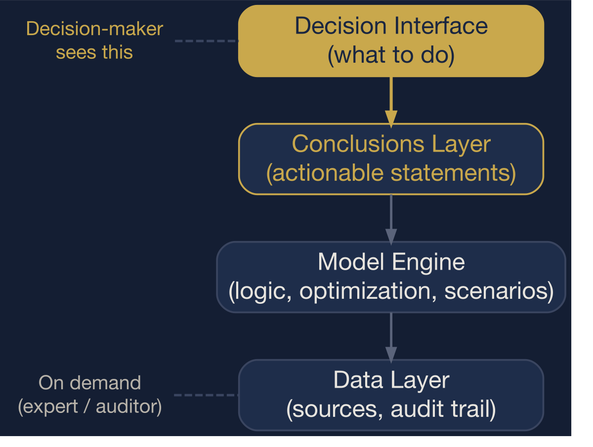
The abstraction stack. Users interact at the top layer. Depth is accessible on demand, not by default.
3. An Engineering Choice, Not a Compromise
The teams that get this right do not start by asking “how do we simplify the output?” They start by asking “what decision does this user face, and what is the minimum they need to see to make it well?” That question produces interfaces that are simple on the surface and rigorous underneath — not because complexity was removed, but because it was placed at the right layer.
The cost of getting this wrong is not just poor adoption. It is a structural misallocation of analytical talent. When a well-built model goes unused because the interface was designed for the analyst rather than the decision-maker, the organization has paid for the analysis without capturing its value.
Abstraction Ratio. The fraction of the system’s analytical depth that is hidden from the primary user by design. A well-engineered interface has a high abstraction ratio — most of the complexity is managed internally, and only the decision-relevant surface is exposed.
A rough formalization captures this:
\[ R = 1 - \frac{E}{C} \]
where \(C\) is the total number of model components (parameters, transformations, assumptions) and \(E\) is the number exposed directly to the primary user. A system with 40 internal components that exposes 4 user-adjustable inputs has \(R = 0.90\). A system that dumps all 40 onto the interface has \(R = 0\). Most dashboards that claim to be “user-friendly” have abstraction ratios below 0.5 — they expose too much of the wrong layer.
Design Principle
Accessible design is not a compromise. It is an engineering choice. The best analytical systems are rigorous in their logic and deliberate in their interface — and the two reinforce each other rather than trade off.
4. Codified Rules
The abstraction principles reduce to four binary gates. An interface that fails any gate has placed complexity at the wrong layer.
| Gate | Condition | Action |
|---|---|---|
| G1 | User must interpret raw model output (coefficients, p-values, residuals) | → Translate to conclusions. The engine stays inside. |
| G2 | Uncertainty shown only as point estimates or not shown at all | → Add ranges or scenarios. False precision is worse than honest uncertainty. |
| G3 | Abstraction ratio \(R < 0.7\) (more than 30% of components exposed) | → Reduce the interface surface. Expose decisions, not parameters. |
| G4 | No path to inspect underlying logic for expert users | → Add a transparency layer. Depth should be accessible, not mandatory. |
These gates are not about simplification. They are about placement. Every component belongs somewhere in the stack. The question is whether it belongs on the interface or inside the engine.
References
- Norman, D. A. (2013). The Design of Everyday Things (Revised and Expanded ed.). Basic Books.
- Tufte, E. R. (2001). The Visual Display of Quantitative Information (2nd ed.). Graphics Press.
- Spiegelhalter, D. (2017). Risk and Uncertainty Communication. Annual Review of Statistics and Its Application, 4, 31–60.
- Gigerenzer, G., & Edwards, A. (2003). Simple Tools for Understanding Risks: From Innumeracy to Insight. BMJ, 327(7417), 741–744.
- Wickham, H. (2010). A Layered Grammar of Graphics. Journal of Computational and Graphical Statistics, 19(1), 3–28.
- Krug, S. (2014). Don’t Make Me Think, Revisited: A Common Sense Approach to Web Usability (3rd ed.). New Riders.